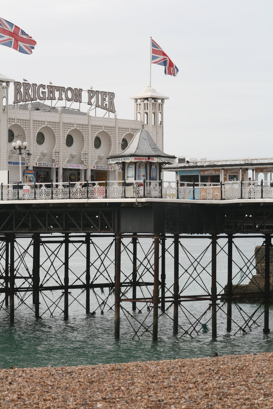
 Picture 1 - Brighton Pier
As you can see, the image on top is the original and the bottom picture is edited.
The editing has made the meaning of the picture change. I feel that the edited picture has a more retro feel towards Brighton Pier - possibly taken a while ago during better times.
In the picture, I changed the colour saturation as well as the sharpness of the pictures and a slight edge blur on the picture. I also changed the overall detail. This meant that there is less detail in a dark space, for example in the support beams underneath the decking.
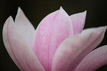
Picture 2 - Brighton Pier


This picture is also of Brighton Pier. As with before, the picture on the bottom is the edited picture and the picture on the top is the original.
With this picture I changed the brightness of the picture, this then gave the appearance that the sun had momentarily been blocked by the clouds. As I edited the brightness it made the support beams under the decking lose detail, to fix this I changed the contrast of the overall picture. I chose not to add any particular effects like blurring.
I feel that the editing again changed the original meaning of the picture. I feel that it has a happier meaning and the brightness of the picture fits with the objects in the picture - a fareground is meant to be a happy place.
Picture 3 -

 The original picture is on the top and the edited version is on the bottom.
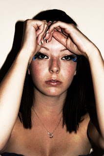
 To start off with, I changed the sharpness of the picture. This change is not able to be seen during the final product but it added detail to all area's of the picture including facial features and hair, particularly identifying the shine on an individual hair and adding more detail.
Secondly, I softened the portrait. This gave the overall picture the darker, tanned effect on the skin, as well as taking away the shine on an individual hair and blending the colours together.
Finally, I added a 'glow' effect on the picture. This gave it the final outcome, making the model look tanned, as well as adding some more light onto the picture. It also softened the skin tones as well as blending light well.
Picture 4 -
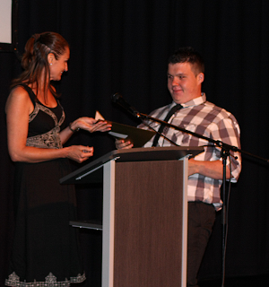

The original picture is on the bottom and the edited version is on the top.
It is clearly visible to see that I have cropped the picture to get rid of all of the empty space around the models. This brings the focus straight onto the people in the picture rather then having the eye wonder around the picture.
I then decided to sharpen the picture, this added detail into the picture and it also meant that it wasn't blurry and the shine on the envelope was reduced. I then removed red-eye from Harry. This makes the picture have a better effect and the eye of the viewer isn't drawn to the eyes instantly.
Finally, I attempted at reducing the noise in the picture, however I could only perform this once as a second time meant that the picture went blurry and lost detail in the hair and shirt/dress. the reduction of noise gave greater detail to the podium as well as the detail on the black dress.
No comments:
Post a Comment